1. Visualization Importance
1.1. Why do we Visualize?
When you are trying to make sense of data that you have, you can present it in multiples ways. You can communicate the insights and the statistics you obtained using tables, numbers or words but sometimes the most effective way to relay your discoveries in an efficient and effective way through data visualization.
Data visualization is representing these statistics and insights using the positions, lengths, and colours of different shapes and lines.

We usually visualize our data to either:
Solve a problem by answering a question (we will look into these types of questions later in this course)
Explore our data to discover new questions that we may have
Let’s take a look at an example and experience exactly how visualizations are sometimes more effective.
(Source: Joel Ostblom - Data Visualization derived from Francis Anscombe)
Look at the four sets of numbers.
We have X and Y values for 4 sets of numbers labelled A through D.
| A | B | C | D | ||||
|---|---|---|---|---|---|---|---|
| X | Y | X | Y | X | Y | X | Y |
| 10 | 8.04 | 10 | 9.14 | 10 | 7.46 | 8 | 6.58 |
| 8 | 6.95 | 8 | 8.14 | 8 | 6.77 | 8 | 5.76 |
| 13 | 7.58 | 13 | 8.74 | 13 | 12.74 | 8 | 7.71 |
| 9 | 8.81 | 9 | 8.77 | 9 | 7.11 | 8 | 8.84 |
| 11 | 8.33 | 11 | 9.26 | 11 | 7.81 | 8 | 8.47 |
| 14 | 9/96 | 14 | 8.10 | 14 | 8.84 | 8 | 7.04 |
| 6 | 7.24 | 6 | 6.14 | 6 | 6.08 | 8 | 5.25 |
| 4 | 4.26 | 4 | 3.10 | 4 | 5.39 | 19 | 12.50 |
| 12 | 10.84 | 12 | 9.13 | 12 | 8.15 | 8 | 5.56 |
| 7 | 4.81 | 7 | 7.26 | 7 | 6.43 | 8 | 7.91 |
| 5 | 5.68 | 5 | 4.74 | 5 | 5.73 | 8 | 6.89 |
How is easy is it for us to find any trends, similarities or contrasts from these four sets?
Can you see the differences in the general trends between these four sets of numbers?
We can use some calculations or more formally called summary statistics to help shed some light on the data and compare and contrast between the 4 sets.
Summary statistics can be calculations such as the mean, median, standard deviation, maximum and minimum values or even the range.
These can help give some idea as we can see here for our 4 sets.
| A | B | C | D | ||||||||
|---|---|---|---|---|---|---|---|---|---|---|---|
| Y | X | X | Y | X | Y | X | Y | ||||
| mean | 9.00 | 7.5 | mean | 9.00 | 7.5 | mean | 9.00 | 7.5 | mean | 9.00 | 7.5 |
| std | 3.32 | 2.03 | std | 3.32 | 2.03 | std | 3.32 | 2.03 | std | 3.32 | 2.03 |
They tell us in this case that they all share the same mean and standard deviation to 2 decimal places. That means the sets all has the same center and spread among the points.
That being said, using 2 measures for all our data points, doesn’t give us the full story about the data and fails to show us exactly how these 4 sets differ.
If we plotted the sets, we would get the following visualizations.
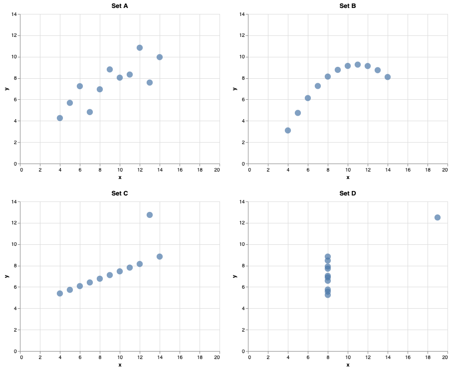
So, although they do share similar means, and standard deviations, we can clearly see that they are vastly different from one another.
Another great illustration to drive home our point is the graphic below from Matejka and Fitzmaurice, 2017.

This shows multiple datasets with similar means and standard deviations to 2 decimals places but are quite different in appearance when visualized.
The moral of the story here is although statistics and calculation can help describe our data, a visualization sometimes really is worth a thousand words here.
This is why it’s so important to use visualizations to effectively communicate our data insights.
1.2. Why Good Data Visualization is so Important
Sometimes it’s best to actually experience a case where analysis improvements occurred to really solidify the effect of good visualizations. Using a case study from the course Data Visualization that I co-developed and its source from here, let’s experience a real occurrence, where changing the visualizations resulted in concrete analysis improvements.
Heart disease is a range of conditions that affect your heart including blood vessel disease and Heart rhythm problems. It is known as the leading cause of death globally with an estimated 17.9 million people dying from it in 2019 (source),
ESS (Which stands for Endothelial Shear Stress) measures the tangential stress due to the friction of the flowing blood on the endothelial surface of the arterial wall. Long story short, low ESS is associated with plaque progression and if doctors can detect regions in the arteries where ESS is low, they can diagnose the patient and take actions early on which improves the patient’s chance of survival.
The regular way of evaluating ESS is using a digital 3D representation of the arteries using blue-red-and green colouring.
Blue indicates areas that could be problematic as ESS is lower here.
Red indicates areas where ESS is higher and not as concerning.
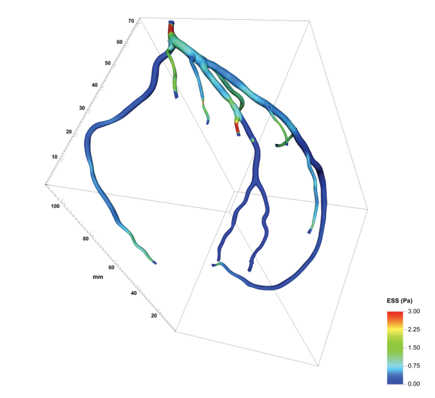
Using this visualization, doctors were able to identify the areas of concern 39% of the time.
Researchers then went off to see how changes to this visualization affected identification rates.
Researchers changed the colour to something more interpretable. It’s important to note that colorblindness affects many individuals particularly the specific red-green colour blindness. Not only that but it’s not always completely clear what values are the ones doctors should be particularly concerned with. The researchers adapted the colours so that low ESS stands out more, and highlighted the area with a red colour, and the rest are in black and white.

With this small modification, doctors were then able to identify the areas of low ESS much better than before and the average identification rate increased to 71%!
Following the change of colour, researchers then changed the number of dimensions that the arteries and blood vessels were shown in.
Researchers then converted the 3D representations of the vessels to 2D. We will talk more about the problems of 3D later on, but generally, it’s difficult for our human brains to assess and a 2D view can be more straightforward to understand.
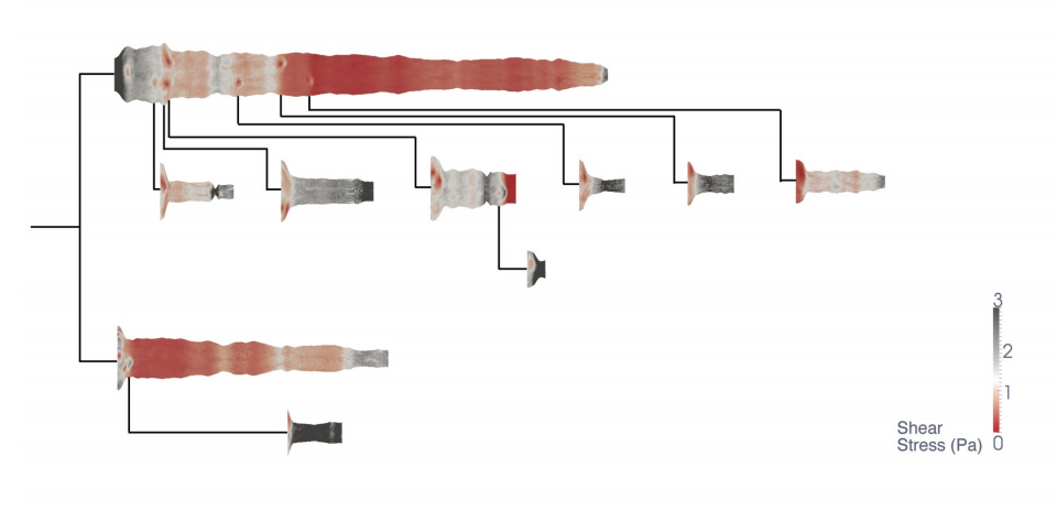
This definitely was the case for the doctors as the 2D representation changed the ESS identification rates from 71% to 91%.
This goes to show how important colour and dimensionality are to effective visualization and thus your analysis.